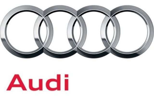
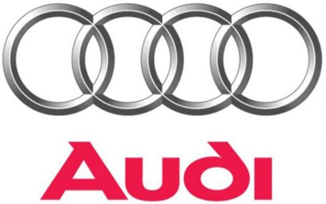
It may not come off as strikingly different at first glance, but rest assured, there is a difference. As part of the company’s 100th anniversary, Audi->ke14 has decided to tweak the very symbol that has made it one of the most successful car brands in history: the company’s official four-ringed logo. Taking you back to history, Audi’s logo involves four overlapping rings that represent the four original marques of Auto Union back in the ‘30’s: Audi, DKW, Horch, and Wanderer.
While the look of the logo remains virtually the same, Audi did some chrome detailing on it, making it more three-dimensional-looking than the previous logo. The other minor change Audi made with its logo was to change the typeface and move the ‘Audi’ name towards the left corner, as opposed to the previous logo where the name was positioned in the center.
We like the new touch of the logo, although were not big fans of the new font Audi decided to use. Nevertheless, we’re equally happy that the company didn’t do any drastic changes on their new insignia. Logo’s are the first thing people associate your brand with and with a brand that has as much history – 100 years worth, to be exact – as Audi, changing the entire look of the logo would have been tantamount to company suicide.
.


