The 2019 Mazda3 has been on quite the press run in the last few months. The latest buzz we’re getting involves the model’s cockpit, specifically the three-color, all-digital gauge cluster that looks to be a massive improvement from its previous iteration. Spy photos of the digital cluster were put up on a Chinese website, and they show two different configurations, each different from the other. The big takeaway here is how Mazda managed to evolve a design that already looked clean and mature in its current version. It's unclear which cluster we'll end up seeing, but each version looks promising.

I’m one of those people that pay close attention to a car’s gauge cluster. I think it’s one of the most underrated parts of a car’s interior, especially for a driver who relies on them exclusively. My rule is that the cleaner the cluster, the better it is. There’s no point in having so many features and tech add-ons when they end up distracting a driver. That’s just counter-productive.
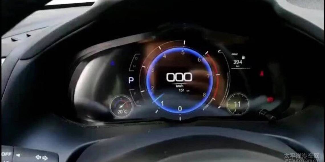
That’s also why I’m a fan of these two digital clusters that Mazda appears to have developed for the Mazda 3. The first configuration is the simpler of the two, and the one I like better. There’s one three-digit speedometer in the center of a blue-ringed tachometer, and all the other pertinent sources of information are wrapped around it. The gear indicator and the water temp displays are on the left, while the fuel range calculator and a digital-analog clock sit on the right. I like this one because it’s clean. There’s no wasted space, and all the information is being served to the driver directly.
The second configuration is a bit busier, partly because it splits the tachometer to the left side of the screen and the speedometer to the right. That’ not really too much of a problem because traditional clusters carry this configuration. There’s no need to get used to it. In between sits a road surface display that some drivers can probably do without. All the pertinent trip information, including the gear indicator, fuel indicator, and water temp display can be found at the bottom. Black spaces on both edges of the cluster suggest that those spaces are reserved for the menu of warning signals. This is another good design, though I do think that Mazda could have shrunk the sizes of the tacho and speedo a bit to accommodate bigger displays for the trip info. With the design in the photo, they look like they’re getting swallowed by the two round meters.

Regardless, both digital clusters get high marks. It’s a testament to Mazda’s ability to improve on car features that don’t necessarily get the attention they deserve. At the very least, these two digital clusters are right up there with some versions that I’ve seen from cars that are segments ahead of the Mazda. Audi, for example, could do itself a favor by taking a page out of Mazda’s playbook to come up with a cleaner-looking digital cluster than the one it has these days.
With regards to other parts of a car and the predisposition to infuse some style and panache on them, the digital cluster is one of those spaces that should remain as simple and as informative as possible. Mazda’s on the right track with its new versions.
References
Read our full review on the 2018 Mazda3.
Read our full driven review on the 2018 Mazda3 Grand Touring.
Read our full speculative review on the 2019 Mazda3.
Read more Mazda news.