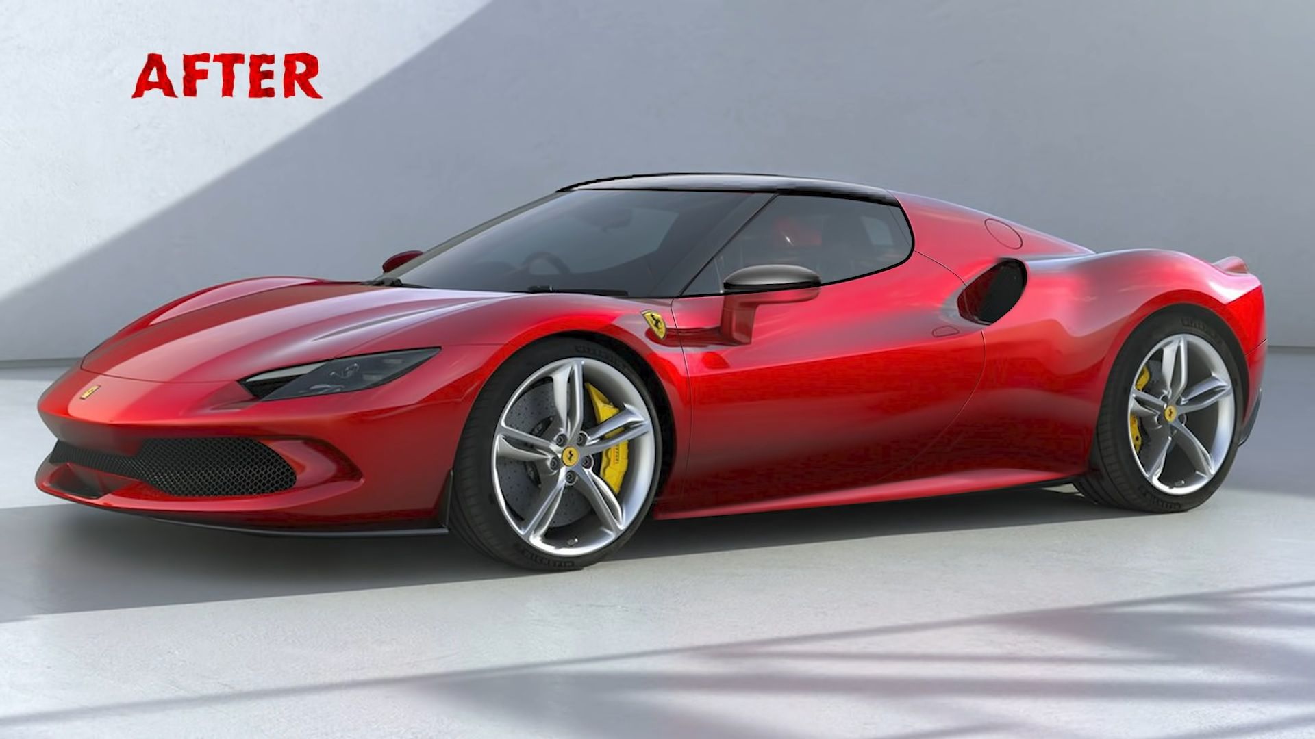
Most will agree that Ferrari makes exquisite cars. Being exclusive, powerful, and exotic cars, they certainly aren’t subtle. Of course, that’s not the point. However, people have a different understanding of what is aesthetically correct and, often, have their own idea of how a certain car should look. Realizing that there are many design critics out there, ex-Ferrari designer Frank Stephenson, who designed cars like the F430 and FXX, decides to give us his vision of the Ferrari 296 GTB in a video on his YouTube channel.
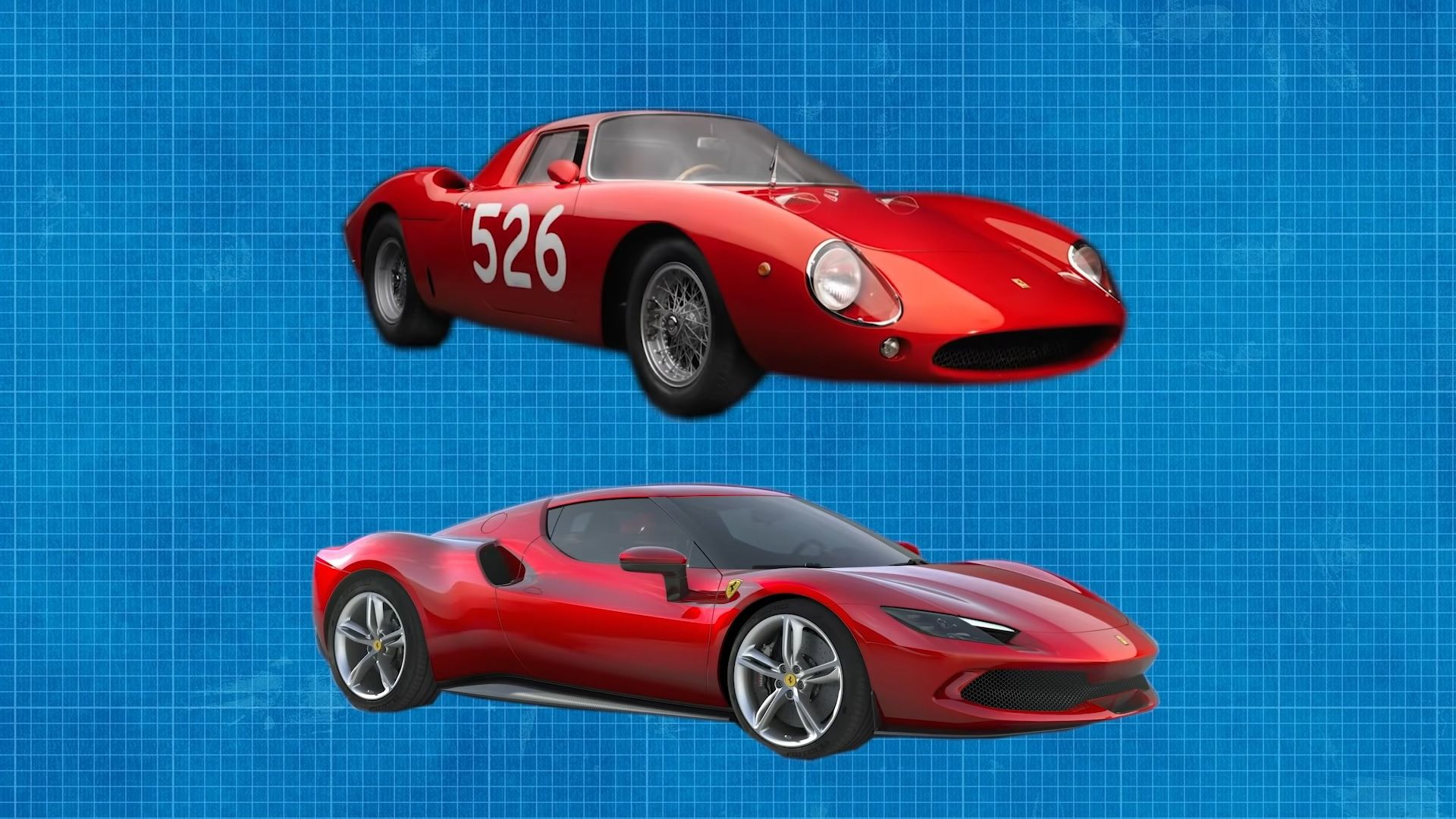
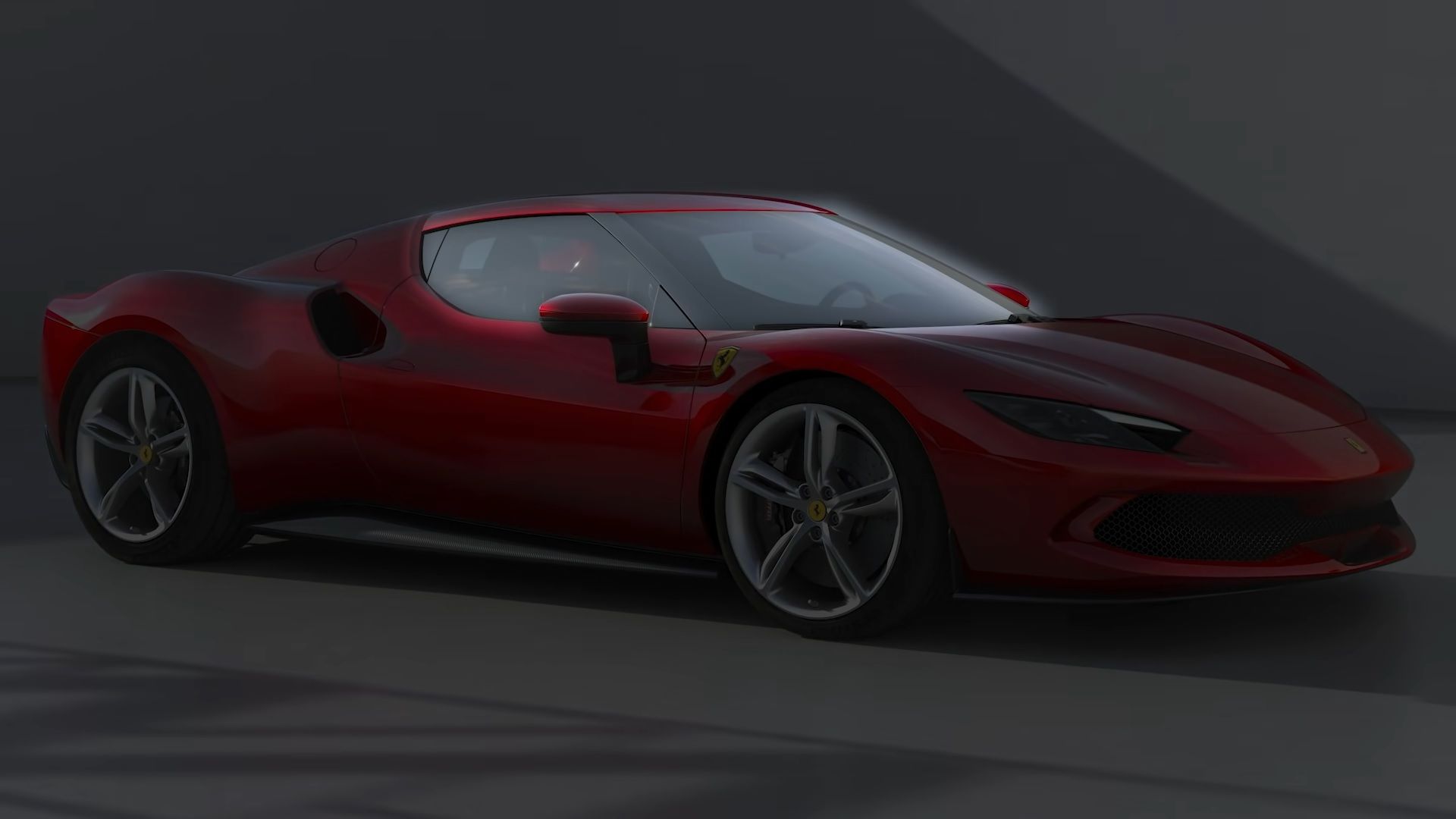
Frank Stephenson points out that, when assessing a car's design, one must look from a three-quarter front perspective “just to come face to face with it for the first time”. Frank initially praises the design of the 296, recognizing that it’s inspired by the 1963 Ferrari 250 LM.}
He then addresses some of the things he’s not exactly in favor of, such as the wide front mouth design, which is a “little too exaggerated” for the designer’s taste.
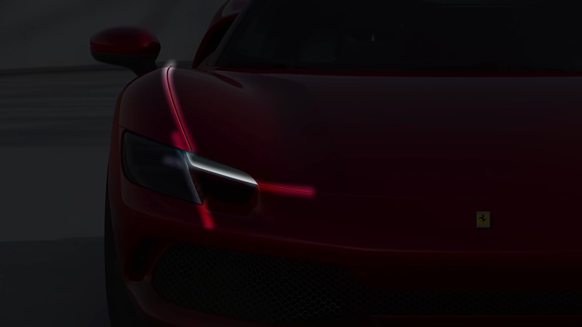
He also likes how the dark A-pillar makes the windshield seem like it wraps around to the side windows, creating a jet-fighter canopy feel. He thinks this can be further enhanced by blacking out the roof thus creating a more cohesive look. However, the “white position lamp” alignment “doesn’t seem to be spot-on”. Frank makes a remark about how “they’ve missed the cutline on the bonnet” (hood), definitely irritating for someone with OCD.
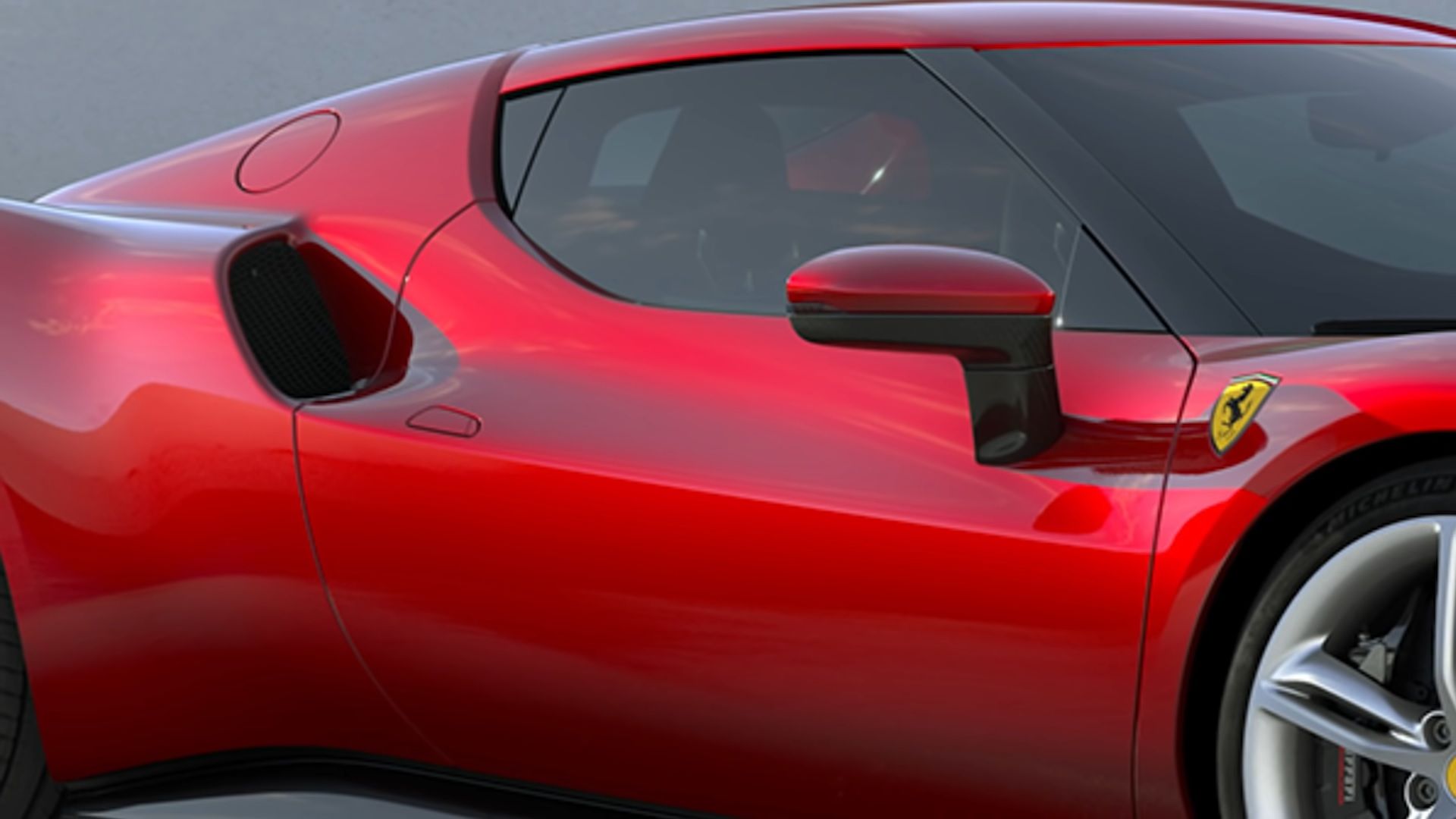
Frank Stephenson praises the profile of the 298 GTB. In particular the apex of the front fender, which is right over the wheel centerline. Looking at it from the cockpit gives you an accurate idea of where the front wheels are. The same praise goes to the rear fenders, which replicate the same design cue. Frank even goes as far as describing them as “biceps”, giving the mid-engine car a very muscular look. It’s also an element taken straight from the 250 LM.
The shape of the side windows leaves something to be desired, however, as it features two apex lines and creates a non-functional dark trim piece, resembling a small window. He also addresses the lack of “broad shoulders”, which create a “hollow area of the air intake” (the inner side). Overall, “very purposeful lines”, “nothing fake, nothing unintentional”.
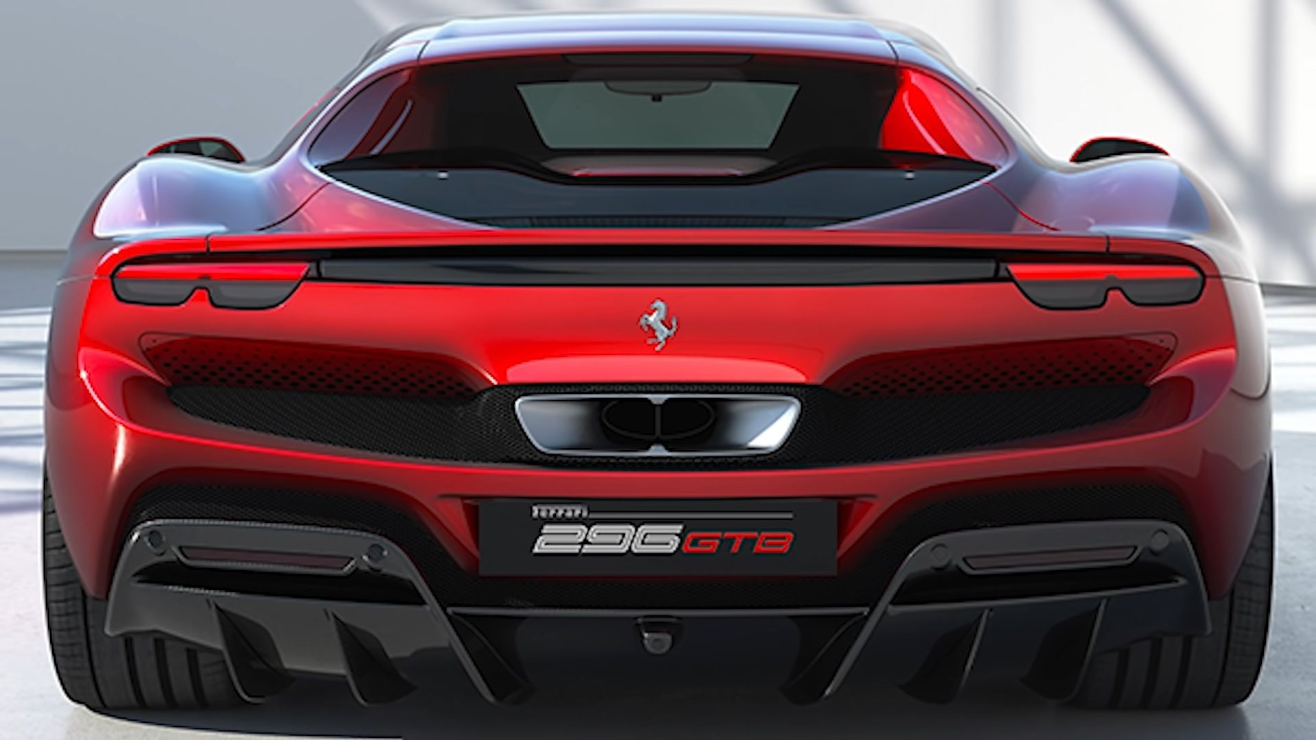
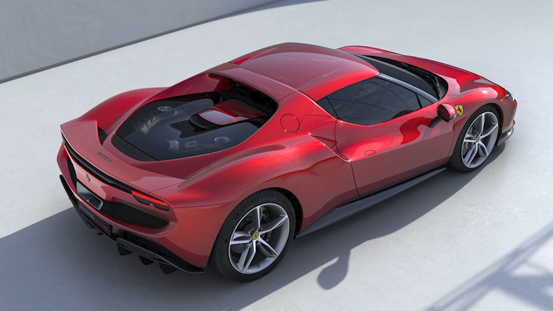
As for the rear, “I absolutely believe that Ferrari should keep round taillights at the back”, the designer says. Two design elements Frank enjoys seeing on the 296 GTB are the vertical rear window and the flying bridge that connects the C-pillars.
However, the big center exhaust tip is too overstyled and a “tooth” slopes down towards it. According to him, the otherwise substantial piece should be moved further up and smoothened out, so it looks flush with the air extractors.
Another aspect of the 296 Frank enjoys is the way the five-spoke rim design has been interpreted for the 296 GTB.
Now that you know what Frank likes and doesn’t like about the 296’s design watch as he reinvents the model in his own vision. In the end, Frank finishes by clarifying the 296 GTB design isn’t retro, but rather reminiscent of the 250 LM, only reinterpreted in a more modern way. “It has two wheels in the past and two wheels in the future and it blends them both. Combines the emotion of the past with the technology of the future”.
Frank loves rating automotive designs and because the 296 isn’t screaming “futuristic design”, it gets 8.9 out of 10. Tell us, how much would you rate the 296 GTB? Do you prefer Frank Stephenson's vision of it or is it perfectly fine as it is?

